CASE STUDY: 3BALLS.COM
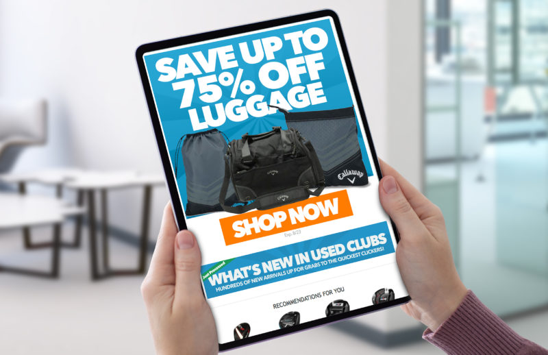


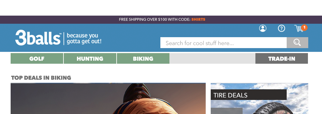
Navigation Redesign Below (Hover for Before/After)
Background:
3balls.com is a large e-commerce website specializing in the sale of used and new golf equipment, apparel and accessories. The site was established in 1998 and has been named one of the 500 top grossing websites in Nortb America by Internet Retailer magazine.
The Challenges:
When the company made a strategic decision to expand into other sports verticals, 2 significant challenges emerged. The first, was that the brand had been known exclusively as a golf retailer for more than 20 years. In fact the tagline even included the word “golf” and the site’s longstanding mascot was an animated golf ball character. This presented a significant branding and positioning problem.
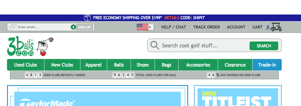
The second was a matter of user design and site structure. With a depth of product offerings across multiple categories, the site’s navigation could easily become unwieldy with the addition of 2 additional sports
Strategy:
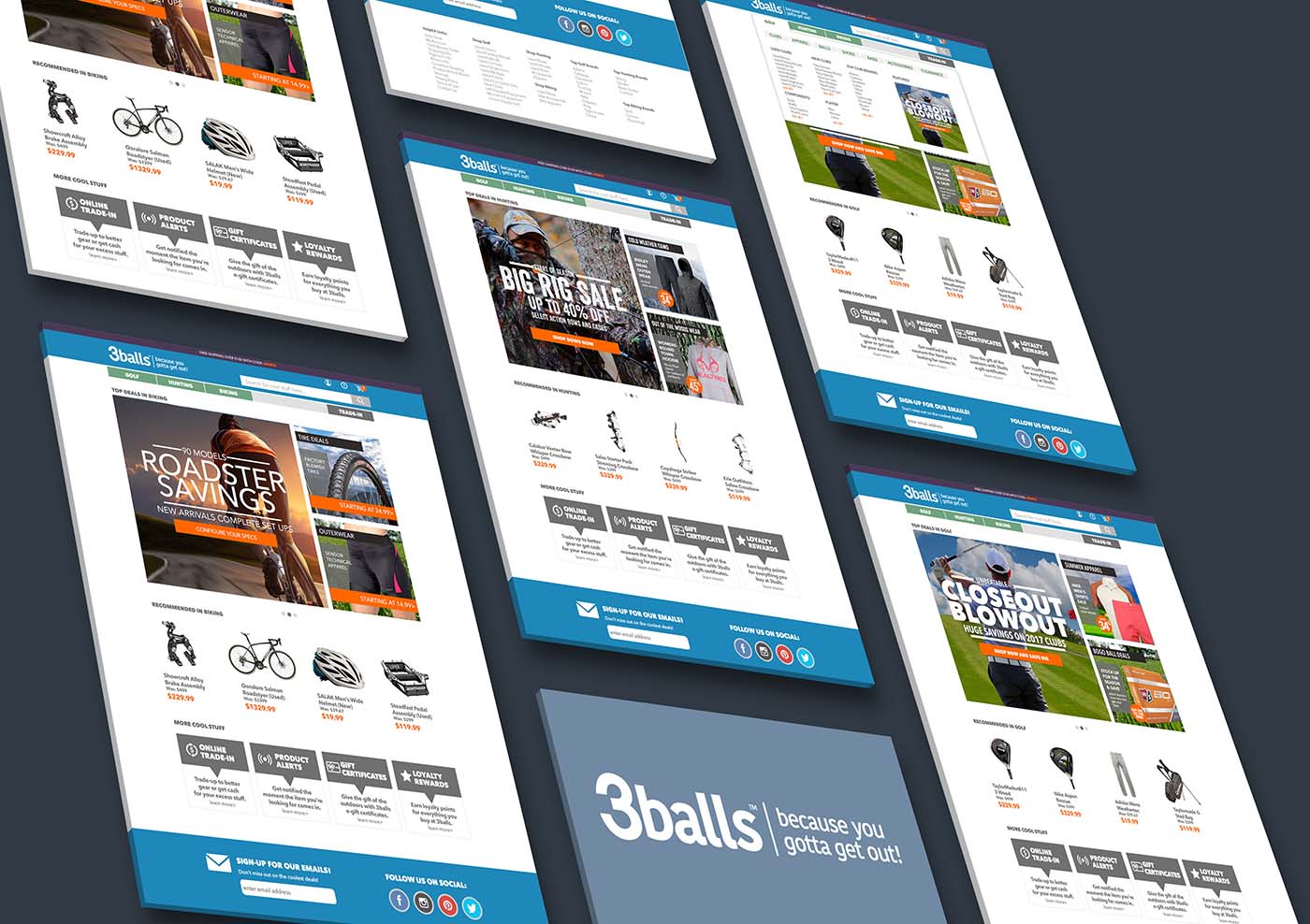
Conduct a rebranding to update the company’s somewhat dated (20 year old) logo and introduce a new tagline that emphasizes the appeal of an outdoor lifestyle instead of only golf. Redesign site homepage such that all 3 featured sports categories (golf, hunting and biking) are given equal prominence and remain shoppable from there. Rework the global navigation to make 3 distinct shopping experiences through clear and distinct navigation tabs and the utilization of mega-navs.
Images Shown:
Array of page re-designs showing multiple verticals
Logo Re-Design
Header/Nav Design Before and After
